 Feedback Bubble
Published 10 October 2026 · By Jonathan Jones
Where to Place a Feedback Widget on Your SaaS Website
Choose a visible, unobtrusive corner for your SaaS feedback widget. Learn how to check fixed controls, mobile layouts and light and dark themes before deciding.
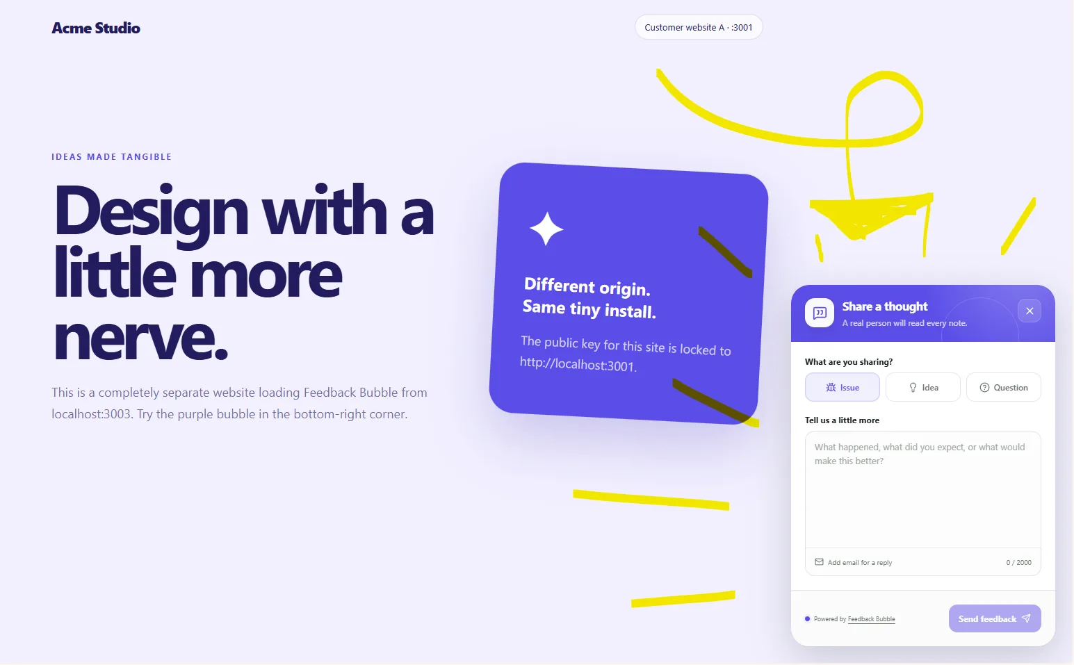
For most indie SaaS websites, a feedback widget is a good starting point in a consistent bottom corner. Choose the left or right side that avoids your existing navigation, support buttons and other fixed controls, then check it on mobile and in light and dark themes. Treat that placement as a test, not a guarantee of more or better feedback: observe your own site and adjust if the launcher gets in the way or is hard to find.
Start with the corner that has more room
A bottom-corner launcher is easy to spot in a familiar place while keeping the main content clear. But there is no universally best side. A persistent help button, cookie notice, mobile navigation or media control may already occupy that space.
Look at the pages where customers are most likely to share feedback, such as a dashboard, settings page or pricing page. Check the page in its normal state and with common overlays open. Leave enough room for the widget to be opened and used without covering a key button or making content difficult to reach.
For example, if your support control is fixed at the bottom right, try the bottom left for feedback, provided that corner is clear. If both corners contain controls, consider whether one can move or whether a feedback link elsewhere in the interface would suit your layout better.
Check the layout on mobile and in both themes
A placement that looks tidy on a desktop can compete with a mobile navigation bar or cover part of a narrow screen. Check several screen widths, including a phone-sized view, and open the widget to see whether its form remains practical to use.
On desktop, check that the launcher does not overlap menus, support controls or important page actions.
On mobile, check that it does not obstruct navigation, content or controls near the bottom edge.
In light and dark themes, make sure the launcher remains easy to distinguish from the page behind it.
Open the form as well as checking the closed launcher. The expanded widget needs room too.
If your product supports a dark theme, test the feedback widget in that setting as well as in light mode. A theme that follows a visitor’s colour preference can help, but still inspect the actual pages and controls around it.
Compare both corners before settling on one
A short manual check is often enough to spot obvious conflicts. Try the widget in the bottom-left and bottom-right positions on your key pages. For each position, note whether the launcher is visible, what it overlaps, and whether the open form is comfortable to use on desktop and mobile.
If you work with a small team, ask someone unfamiliar with the setup to find the feedback option. Their first attempt can reveal when a launcher is visually buried or competes with another control. Keep a simple record of what you saw, then choose the clearer position and review it again after significant layout changes.
This is a usability check, not proof that one corner will produce more submissions. Without evidence from your own visitors, avoid treating placement as an automatic way to increase feedback.
Choose a position in Feedback Bubble’s editor
Feedback Bubble lets you place the launcher in the bottom left or bottom right. To compare them, go to Dashboard > Bubbles, select Customise for the relevant website, and use the live preview to inspect the open and closed widget states. The editor also lets you set the theme to Auto, Light or Dark. These controls make it possible to review the design before saving it; they do not automatically determine the best position for your visitors.
After you save a design change, the existing site key loads the updated appearance, so you do not normally need to paste the installation script again. For further setup details, see the guide to customising a feedback widget.
A feedback widget is one way to hear from customers where they encounter a problem or idea. Feedback Bubble’s website feedback widget keeps that option on the page; your own layout checks should guide which corner you use.
A placement checklist
List the fixed controls on your key pages and note which corners they occupy.
Preview the widget in both bottom corners.
Check desktop and mobile layouts, including the open form.
Review light and dark themes, then record any overlaps or visibility issues.
Choose the clearer position, save it and revisit the decision if your interface changes.
The useful position is the one customers can find without blocking the product. Compare both corners on your own pages, then choose the one that fits your interface.